
DISCLAIMER: Foreign Exchange trading is a high-risk activity. This post or any content on this blog should not be taken as financial or trading advice of any kind.
Traders usually have or are in a search for the so called “market edge”, which is the insight, the pattern or the idea that one uses to have a consistently higher probability of being correct while operating. This edge can be quite difficult to find, mostly because it involves lots of screen time and studying, and even like that the whole concept can be quite difficult to grasp to most people.
This article aims to show a possible pattern that could be further explored and studied. This is, by no means, a complete work, and my goal is to just kickstart an idea which is quite simple, but still far away from being usable to trade; it can, however, serve as a building block for a strategy.
The pattern
The idea consists in the concept of trend following but looking at the intraday period (M5 timeframe). We take the current range of the day and wait for a break, higher or lower. After that we analyze if there is any persistance of the movement to the same direction. To do that we have to first decide what is a break, which is going to be determined by the usage of pivots (or fractals).
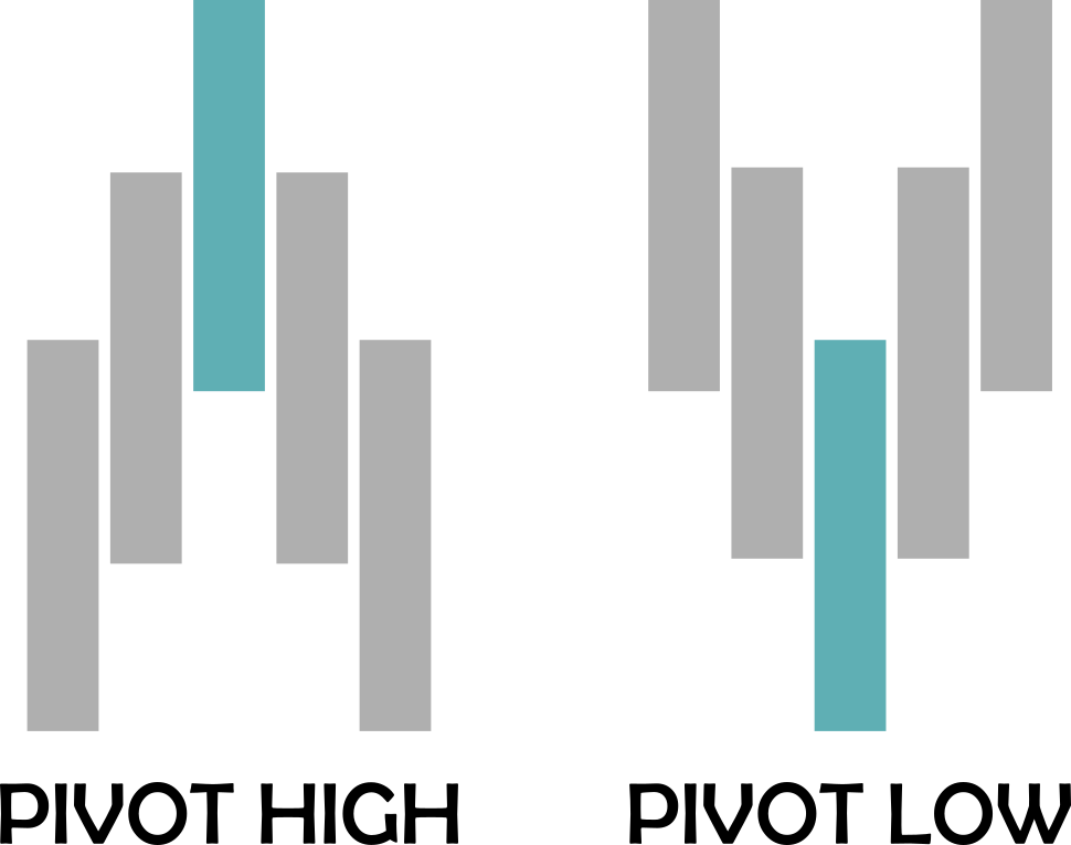
A pivot, in this study, is a price pattern where we have 5 candles or bars. The pivot high happens when the middle bar has a high point higher than the previous two bars highs and the following two bars highs. Similarly, a pivot low happens when the middle bar has a low point low than the previous two bars lows and the following two bars lows.
If we plot all the pivot points on a chart we will get a lot of them. We then will filter those that represent a break of the highest high or lowest low of the day so far, starting from de New York session (area of the image below with a lighter gray background).
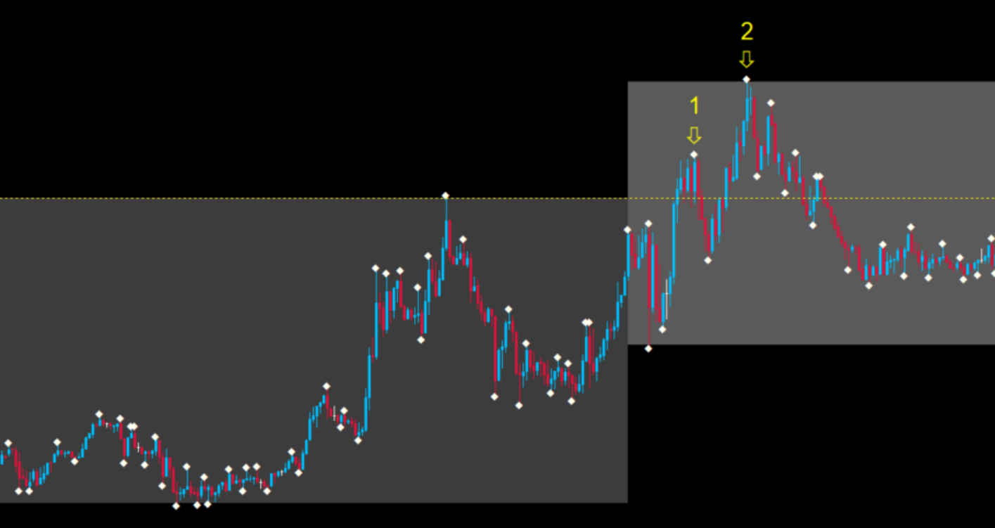
In the case above we have two pivot highs that meet the criteria.
To summarize, this is what we are analyzing:
Count how many pivots break the current high or current low of the day starting from the NY session.
The general hypothesis is: if we have a highest high or a lowest low after the beginning of the NY session, we can expect at least another break on the same direction until the end of the day. This is aligned with the idea of trend following because we wait for the market to give a direction and then expect it to continue with it.
We will proceed to check how often this happens.
Getting the data
The analysis used M5 charts from the pairs formed by the combination of the 8 most trades currencies, plus Gold/US Dollar (XAUUSD), a total of 29 pairs, from september (sometimes july) of 2019 until june 2020.
# Initial imports
import pandas as pd
import dask.dataframe as dd

# Read all csv's and fix columns
dataset = dd.read_csv(r'\data\*.csv', include_path_column=True)
dataset.columns = ['Date', 'Time', 'Open', 'High', 'Low', 'Close', 'Volume', 'Pair']
dataset['Date'] = dd.to_datetime(dataset['Date'] + ' ' + dataset['Time'])
dataset = dataset.drop('Time', axis=1)

# Compute dask dataframes to pandas dataframes
dataset = dataset.compute()

# Clean pair names
dataset['Pair'] = dataset['Pair'].str.replace("c:/Users/eduardo/Documents/ForexEdge/data/","")
dataset['Pair'] = dataset['Pair'].str.replace('5.csv','')
dataset['Day'] = dataset['Date'].dt.date
dataset['Hour'] = dataset['Date'].dt.hour

# Get unique pair names
pairlist = dataset['Pair'].unique()

# Create empty dataframes to get results of break highs and lows
newdfhigh = pd.DataFrame()
newdflow = pd.DataFrame()

dataset
Date	Open	High	Low	Close	Volume	Pair	Day	Hour
0	2019-07-08 06:15:00	0.91324	0.91327	0.91321	0.91325	117	AUDCAD	2019-07-08	6
1	2019-07-08 06:20:00	0.91325	0.91337	0.91324	0.91328	153	AUDCAD	2019-07-08	6
2	2019-07-08 06:25:00	0.91327	0.91329	0.91308	0.91312	169	AUDCAD	2019-07-08	6
3	2019-07-08 06:30:00	0.91312	0.91315	0.91288	0.91312	232	AUDCAD	2019-07-08	6
4	2019-07-08 06:35:00	0.91311	0.91311	0.91293	0.91297	131	AUDCAD	2019-07-08	6
...	...	...	...	...	...	...	...	...	...
66598	2020-05-29 01:35:00	1719.86000	1719.86000	1718.67000	1718.72000	184	XAUUSD	2020-05-29	1
66599	2020-05-29 01:40:00	1718.72000	1719.24000	1718.68000	1718.96000	139	XAUUSD	2020-05-29	1
66600	2020-05-29 01:45:00	1718.96000	1719.48000	1718.93000	1718.94000	163	XAUUSD	2020-05-29	1
66601	2020-05-29 01:50:00	1718.96000	1719.05000	1718.65000	1718.94000	94	XAUUSD	2020-05-29	1
66602	2020-05-29 01:55:00	1718.89000	1719.17000	1718.81000	1719.07000	39	XAUUSD	2020-05-29	1
1907362 rows × 9 columns
Calculating pivots
Now we will iterate over each pair and day in order to calculate all the pivot points, both high and low. The decision to have separate dataframes for them was to make it easier to perform the calculations. They will be merged when we have the results.
# Iterate over each pair
for pair in pairlist:

  dfprov = dataset[dataset['Pair'] == pair].copy()

  # Identify the pivot pattern
  dfprov['PivotHigh'] = dfprov[(dfprov['High'] > dfprov['High'].shift(1)) &
                        (dfprov['High'] > dfprov['High'].shift(2)) &
                        (dfprov['High'] > dfprov['High'].shift(-1)) &
                        (dfprov['High'] > dfprov['High'].shift(-2))]['High']
  dfprov['PivotLow'] = dfprov[(dfprov['Low'] < dfprov['Low'].shift(1)) &
                        (dfprov['Low'] < dfprov['Low'].shift(2)) &
                        (dfprov['Low'] < dfprov['Low'].shift(-1)) &
                        (dfprov['Low'] < dfprov['Low'].shift(-2))]['Low']

  dfprov['AnyPivot'] = pd.notna(dfprov['PivotHigh']) | pd.notna(dfprov['PivotLow'])
  dfpivots = dfprov[dfprov['AnyPivot']]
  dfpivots = dfpivots.drop(['Open', 'High', 'Low', 'Close',	'Volume'], axis=1)

  days = dfpivots['Day'].unique()

  # Iterate over each day
  for day in days[1:-1]:

    dfdayhigh = dfpivots[(dfpivots['Day'] == day) & (dfpivots['PivotHigh'] > 0)].copy()
    dfdaylow = dfpivots[(dfpivots['Day'] == day) & (dfpivots['PivotLow'] > 0)].copy()

    # Get cumulative high and low
    dfdayhigh['CurrentHigh'] = dfdayhigh['PivotHigh'].cummax()
    dfdaylow['CurrentLow'] = dfdaylow['PivotLow'].cummin()

    # Compare value to previous candle
    dfdayhigh['PrevHigh'] = dfdayhigh['CurrentHigh'].shift(1)
    dfdaylow['PrevLow'] = dfdaylow['CurrentLow'].shift(1)

    # Filter the pivot points that represent a current high or low of the day
    dfdayhigh['BreakHigh'] = dfdayhigh.apply(lambda x : True if x['CurrentHigh'] > x['PrevHigh'] else False, axis=1)
    dfdaylow['BreakLow'] = dfdaylow.apply(lambda x : True if x['CurrentLow'] < x['PrevLow'] else False, axis=1)

    # Append the results
    newdfhigh = newdfhigh.append(dfdayhigh)
    newdflow = newdflow.append(dfdaylow)
Filtering
With this done we can now filter the results we have. While the filtering could also have been done before, it can be useful to have a more complete data first, just in case there are other analysis we want to do.
The filtering is to get pivot points that happened from 15h00 forward because that is the time of the NY open on the data used here. Then we sum the number of times we had a highest high or lowest low using the GroupBy function.
# Select criteria do be met and group by pair and day
# while aggregating the sum of breaks per day
bhigh = newdfhigh[newdfhigh['Hour'] >= 15].groupby(['Pair', 'Day']).agg(breakshigh = ('BreakHigh', 'sum')).reset_index()
blow = newdflow[newdflow['Hour'] >= 15].groupby(['Pair', 'Day']).agg(breakslow = ('BreakLow', 'sum')).reset_index()

# Merge the results into one dataframe
merged = pd.merge(bhigh, blow, how='left', left_on=['Pair', 'Day'], right_on=['Pair', 'Day'])
Connecting to a SQL Server
I decided sometime ago that I would keep all my databases in a SQL Server or MongoDB database, depending if it is relational or not. This allows me to easily move around different tools, which is something I wanted to do for this study in particular.
We can now connect to the SQL Server and send the dataframe to it.
# Import for SQL connection
import pyodbc
import sqlalchemy as sal
from sqlalchemy import create_engine

engine = sal.create_engine('mssql+pyodbc://localhost\SQLEXPRESS/data_counts?driver=SQL Server?Trusted_Connection=yes')

conn = engine.connect()

# Export dataframe to the SQL Server database
merged.to_sql('merged_data', con=engine, if_exists='append', index=False, chunksize=1000)
Plotting the data
While Python has many amazing libraries for plots and charts I wanted to have a “drag and drop” way of managing this study, which is something I enjoy doing. Sometimes if the result is not so nice I might move back to Python and do it with Bokeh or Plotly, for example, but then I will already have a nice visual idea of how it is going to be.
Inside PowerBI I connected to my SQL Server and imported the data. From there I decided to use a 100% stacked bar chart. I figured it could be an easy way of seeing the data of all pairs at once but keeping each one separate. It was also decided to keep the high breaks separate from the low breaks because of a special circumstance; sometimes we have a break high, then a break low, then a break high. In theory this means we have two different “market signals”. However, I kept the analysis simple, so if there is a break high, independently of any break lows that might happen, we want to know how often can be expected a new highest high during the day, and similarly for the lows.
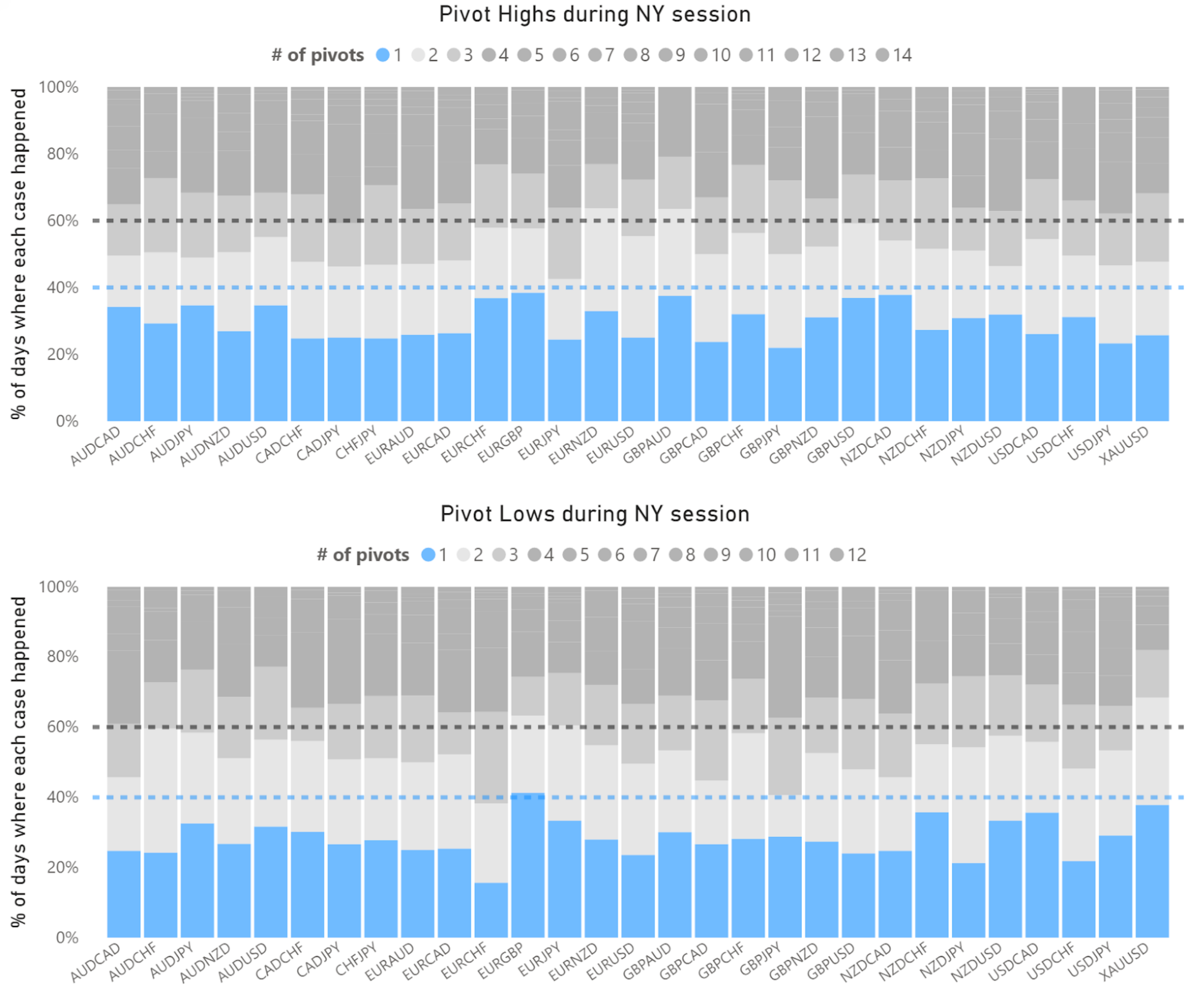
Here we see some quite interesting things. The blue part of the charts represent the number of times we had only one highest high or lowest low. While it is clearly the most common occurence, it never happens more than 40% of the time, with one exception (EURGBP break lows). In most cases the singular break high or low happens around 30% of the time.
Notice that I am not being so precise with these numbers, and that has a reason: this is not a small sample but it is also not very big. That means that the exact percentages will change over time depending on market conditions (and we have had a very turbulent ride over the last 12 months). More than looking for getting the exact probability for an event to happen, it is better to understand the overall behavior of what we are studying, also because it is unlikely that any precise number can hold its own in the future.
But what we can see is that it is quite safe to assume that, if we have a highest high or lowest low after the NY session begins, we can expect more often than not at least one more move to the same direction of this break, with a probability from 60% to 70% or maybe even higher.
After two breaks, however, we can’t expect a third one with the same confidence. The probability of a third break seems to sit around the 50% line or lower, not being so reliable, or at least not so much in terms of being considered as a “trading edge”.
The interactive chart can be found clicking here.
Conclusion
If a Forex trader wants to work on a strategy this can give some insight on where to look. Of course, there is nothing here that suggests profitability just with the results shown, there is no risk management mention, entry or exits, pair selection, etc. But it is a pattern that can be explored cautiously.
I found the process of performing this analysis quite interesting. While the results are good for motivating further studies, the coding part was very nice too. The integration of different tools and resources is, above all, a skill to be developed continually. In this case I could have done everything only with Python or PowerBI, but sometimes there is a slightly better or easier way of doing some part of the work. A proper database server (in this case SQL Server) just makes this transition very practical.
If we have so many great tools at our disposal, why not use some of them in an efficient way?