
DISCLAIMER: Foreign Exchange trading is a high-risk activity. This post or any content on this blog should not be taken as financial or trading advice of any kind.
A very popular trading indicator is called Average True Range, or simply ATR. This is an indicator to measure market volatility in terms of the difference between the highest and lowest prices of a day, session or any period of time, being a useful tool for traders that are trying to predict how much the price of a given asset will move on the current or future period.
Its value comes from the taking the average of the true range, the latter being calculated as the maximum of: high - low; abs(high - previous close); abs(low - previous close). The equation looks like this:
\[TR = max[(High - Low),abs(High - PrevClose),abs(Low - PrevClose)]\] \[ATR(n) = \frac{\sum_{i=1}^nTR_i}{n}\]The reason why the indicator doesn’t use only High and Low is that sometimes price will gap from one session to the next. This is particularly frequent with markets that have limited session times, like stocks and futures. With Forex, the target of this article, the market is open most of the time between monday to friday, and usually gaps will happen, if they happen at all, on the monday opening (sunday evening for most countries). We will keep the equation like that because most softwares do it like that.
ATR as a range predictor
As stated before, a common usage of the ATR is to predict future range. This is useful to set take-profits and stop-losses. If, on average, price has a range of 100 pips (or 1000 points) during a single day, a trader can calculate, from its entry point, how much space is there for a probable move in his or hers direction, and set the target with this difference in mind. Or maybe the trader can expect a reversal whenever the current range has already reached the ATR value.
Trading is an activity of dealing with probabilities, and every percentual point can make a big difference in the long term outcome of a strategy.
Whenever we talk about an average, we somehow have a normal distribution in mind. Even if someone has no clue what a normal distribution is, it is easy to assume that if you are dealing with an average, that is probably the value with a 50% chance of happening.
Of course this doesn’t happen in real life (or “real” statistics, should I say). There are various probability distributions and there are plenty that don’t have a nice looking, symmetrical aspect.
One big issue with this indicator is that it is averaging values that don’t have a clear upper limit but have a fixed lower limit. While any news event or market activity can cause the market to move, and therefore, produce a positive price range, there is no circumstance where we can have a negative range.
The pip (or point) range for any particular timeframe, could be expressed as:
\[Range \in \mathbb{R}, Range \geq 0\]This means that this variable can only have outliers on the upper side; while we will never have a range of -200 points (because the formula doesn’t allow it), we can have ranges of +200, +1000, +200000 or more pips (there might be a limit that would mean the colapse of the entire world economy, but let’s not get into that).
My goal here, then, is to check how well does the ATR predicts the next session range, given that this is a common way of using the tool. The hypothesis is that this indicator gives a biased result, and that the next sessions’ range is at least equal the ATR less than 50% of the observations.
A first test with one pair and one timeframe
I will start by analyzing only the British Pound/US Dollar (GBPUSD) pair with the daily timeframe (1440 minutes). This will allow me to create the necessary code and have a first result, to later expand to more pairs and timeframes.
# Imports and read file
import pandas as pd
import numpy as np

gbpusd = pd.read_csv('/content/drive/My Drive/Colab Notebooks/ATR study/GBPUSD1440.csv')

# Clean data
gbpusd.columns = ['Date','Time','Open','High','Low','Close','Volume']
gbpusd = gbpusd.drop(['Time','Volume'], axis=1)
gbpusd['Date'] = pd.to_datetime(gbpusd['Date'])

# Calculate ranges
# I usually do everything separated so there are not too many chained methods
gbpusd['Range'] = gbpusd['High'] - gbpusd['Low']
gbpusd['TRangeH'] = abs(gbpusd['High'] - gbpusd['Close'].shift(1))
gbpusd['TRangeL'] = abs(gbpusd['Low'] - gbpusd['Close'].shift(1))
gbpusd['TR'] = gbpusd[['Range','TRangeH','TRangeL']].max(axis=1)

# Calculate ATR for 14 trading days
gbpusd['ATR14'] = gbpusd['TR'].rolling(window=14).mean()

# Create a column to check if the range of a given session hit the ATR or not
# Have to remember to always calculate the TR against the ATR from the previous period
gbpusd['HitATR'] = gbpusd['TR'] > gbpusd['ATR14'].shift(1)

# Calculate the ratio of observations where the range hit the ATR
# I start from the 15th row because we needed a window of 14 periods to calculate the ATR
print(gbpusd.iloc[14:,]['HitATR'].sum()/gbpusd.iloc[14:,]['HitATR'].count())
0.4191897654584222
This first result shows that the range for any given day reached the ATR(14) value of the previous day only 41.9% of the time. Let’s plot all the observations in a chart to see how this data looks like.
# I will create another column to calculate, in %, how far away the current range was in terms of the ATR
gbpusd['Diff'] = (gbpusd['TR'] - gbpusd['ATR14'].shift(1))/gbpusd['ATR14'].shift(1) * 100
gbpusd.iloc[14:,].head(5)
   Date         Open    High    Low     Close   Range   TRangeH TRangeL TR      ATR14       HitATR  Diff
14 1993-04-16	1.5370	1.5425	1.5220	1.5250	0.0205	0.0050	0.0155	0.0205	0.018379    True    10.469592
15 1993-04-19	1.5270	1.5435	1.5250	1.5422	0.0185	0.0185	0.0000	0.0185	0.019057    True    0.660707
16 1993-04-20	1.5410	1.5560	1.5375	1.5480	0.0185	0.0138	0.0047	0.0185	0.019679    False   -2.923538
17 1993-04-21	1.5475	1.5535	1.5350	1.5400	0.0185	0.0055	0.0130	0.0185	0.019143    False   -5.989111
18 1993-04-22	1.5390	1.5645	1.5330	1.5620	0.0315	0.0245	0.0070	0.0315	0.019500    True    64.552239
import seaborn as sns
import matplotlib.pyplot as plt

plt.figure(figsize=(10,8))
sns.set_color_codes()
sns.distplot(gbpusd['Diff'], kde=True, rug=False, bins=500, color="y", label='Range');
plt.axvline(0, 0, 1, label='ATR')
plt.legend()
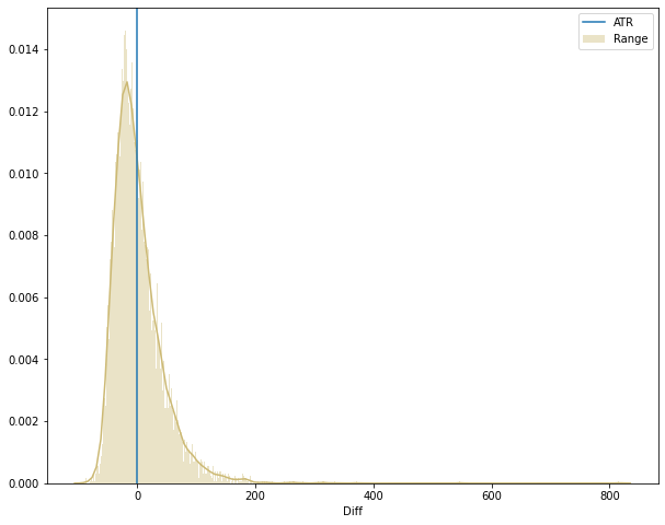
gbpusd['Diff'].describe()
count    7035.000000
mean        1.390805
std        42.930905
min       -87.987520
25%       -26.445736
50%        -7.448790
75%        19.560309
max       816.574020
Name: Diff, dtype: float64
This plot and the describe method shows some outliers. Of course, there are days where some big event will make the price range go really high. We can have an idea if they are a recurrent event, taking a look on how many observations we have with a range 200% higher than the ATR.
print('Total observations with range 200% or more above ATR: ' + str(gbpusd['Diff'][gbpusd['Diff'] > 200].count()))
print('Rate of observations with range 200% or more above ATR: ' + str(round(100*(gbpusd['Diff'][gbpusd['Diff'] > 200].count())/gbpusd['Diff'].count(),3)) + '%')
Total observations with range 200% or more above ATR: 17
Rate of observations with range 200% or more above ATR: 0.242%
With these outliers corresponding to only 0.242% of the dataset, it is better to perform the analysis without them and redraw the chart.
(Keep in mind that days with extremely high volatility usually come with high spreads and unusual market behavior).
x = gbpusd[gbpusd['Diff'] <= 200]

plt.figure(figsize=(10,8))
sns.distplot(x['Diff'], kde=True, rug=False, bins=50, color="y", label='Range');
plt.axvline(0, 0, 1, label='ATR')
plt.legend()
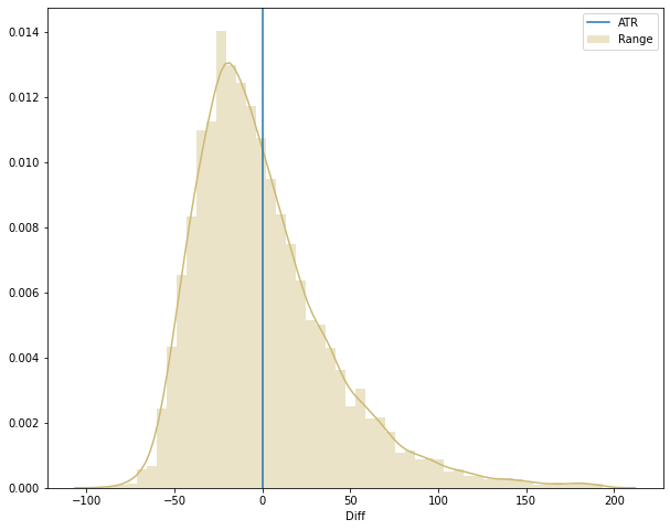
With a better looking image we can see that the data is more heavily distributed on the left side of the blue line, indicating that more often than not the price range does not hit the ATR. To be sure, we can calculate the median and plot it on the chart (the median represents the value that separates the density curve in two halves, or 50%).
median = gbpusd['Diff'].median()

plt.figure(figsize=(10,8))
sns.distplot(x['Diff'], kde=True, rug=False, bins=50, color="y", label='Range');
plt.axvline(0, 0, 1, label='ATR')
plt.axvline(median, 0, 1, color='r', label='Median')
plt.legend()
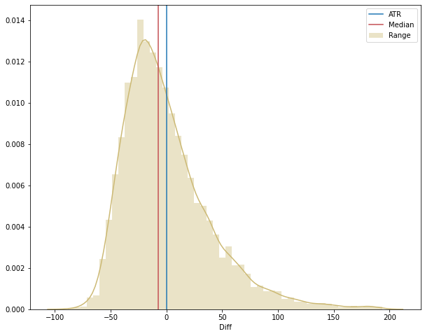
In the end, we could have just plotted the median against the ATR and we would know that the ATR is hit less than 50% of the time. However, it is important to construct the idea in a organized way because it can give some interesting ideas going ahead, for example:
- Checking different pairs in different timeframes can yield different results;
- Trying another parameter for the ATR indicator can serve as a better prediction;
- We could use the median, instead of the mean, or even the mode as the indicador (they would come with their own peculiarities though).
Testing with a bigger sample
Now that we have this data for the GBPUSD pair from april-1993 until may-2020, we can check if this behavior happens with other pairs and different ATR periods.
I downloaded daily charts from 28 pairs. With each dataset we will run the calculations for every ATR parameter from 1 to 100. We will get the rate of times the ATR was hit for all combinations. After that we can plot the data and draw our final conclusions.
Using an ATR of 1 period means that we are taking the average of a single day, which is the same as the range of that day without calculations.
I uploaded the csv files into Google Drive (I used Colab for this code). To read the files I will use Dask because it can read more than one csv’s at the same time, but then I turn back to Pandas because we can then use the unique() method, which is not yet implemented in Dask.
import dask.dataframe as dd

dataset = dd.read_csv('/content/drive/My Drive/Colab Notebooks/ATR study/*.csv', include_path_column=True, names=['Date', 'Time', 'Open', 'High', 'Low', 'Close', 'Volume'])
# It is important to use include_path_column, otherwise we won't be able to know which row relates to each pair
# We just have to clean this last column to get only the pair name and not the entire file path

dataset.head(2)
Date	        Time	Open	High	Low	Close	Volume	path
2003.01.21	10:00	0.9072	0.9087	0.8967	0.9025	194	/content/drive/My Drive/Colab Notebooks/ATR st...
2003.01.21	13:00	0.9072	0.9087	0.8967	0.9025	194	/content/drive/My Drive/Colab Notebooks/ATR st...
# I chained two replace methods, which might not look so nice but is quite efficient on doing the job
dataset['path'] = dataset['path'].str.replace('/content/drive/My Drive/Colab Notebooks/ATR study/','').str.replace('1440.csv','')
dataset = dataset.rename(columns={'path': 'Pair'})

dataset.head(2)
Date	    Time	Open	High	Low	Close	Volume	Pair
2003.01.21  10:00	0.9072	0.9087	0.8967	0.9025	194	AUDCAD
2003.01.21  13:00	0.9072	0.9087	0.8967	0.9025	194	AUDCAD
# Clean data
dataset = dataset.drop(['Time','Volume'], axis=1)
dataset['Date'] = dd.to_datetime(dataset['Date'])

# Transform Dask dataframe into Pandas dataframe with compute
df = dataset.compute()

# Create list to iterate on
pairs_list = df['Pair'].unique()

# Create list of ATR parameters
atr_list = range(1, 101)

# Create dataframe to gather statistics
df_stats = pd.DataFrame()

for pair in pairs_list:
  df_calc = df[df['Pair'] == pair]

  # Calculate ranges
  df_calc['Range'] = df_calc['High'] - df_calc['Low']
  df_calc['TRangeH'] = abs(df_calc['High'] - df_calc['Close'].shift(1))
  df_calc['TRangeL'] = abs(df_calc['Low'] - df_calc['Close'].shift(1))
  df_calc['TR'] = df_calc[['Range','TRangeH','TRangeL']].max(axis=1)

  # Inside this loop, we will iterate on the ATR parameter values to get all the calculations done
  for param in atr_list:
    # Calculate ATR
    df_calc['ATR'] = df_calc['TR'].rolling(window=param).mean().copy()
    # Create a column to check if the range of a given session hit the ATR or not
    df_calc['HitATR'] = df_calc['TR'] > df_calc['ATR'].shift(1).copy()
    # Calculate the ratio of observations where the range hit the ATR
    ratio_hit = df_calc.iloc[param:,]['HitATR'].sum()/df_calc.iloc[param:,]['HitATR'].count()
    # Calculate, in %, how far away the current range was in terms of the ATR
    df_calc['Diff'] = ((df_calc['TR'] - df_calc['ATR'].shift(1))/df_calc['ATR'].shift(1) * 100).copy()
    # Calculate the median of the difference
    median = df_calc['Diff'].median()
    # Calculate the mean of the difference
    mean = df_calc['Diff'].mean()
    # Insert stats into dataframe
    stats_list = [[pair, param, ratio_hit, median, mean]]
    df_stats = df_stats.append(stats_list)

df_stats.columns = ['Pair', 'ATR period', 'Hit Ratio', 'Median', 'Mean']
df_stats.head(5)
Pair	ATR period	Hit Ratio	Median	    Mean
AUDCAD	1	        0.492657	-0.642590   10.796573
AUDCAD	2	        0.466503	-3.601108   5.965425
AUDCAD	3	        0.446126	-4.936540   4.217882
AUDCAD	4	        0.437764	-5.314010   3.153328
AUDCAD	5	        0.438530	-5.309735   2.633682
Now we can finally make some plots in order to better visualize the data.
plt.figure(figsize=(10,6))
sns.scatterplot(x=df_stats['ATR period'], y=df_stats['Hit Ratio'], color="y", label='Hit Ratio for all pairs and ATR parameters');
plt.axhline(0.5, 0, 1, label='ATR', linewidth=3)
plt.ylabel('Hit Ratio in %')
plt.ylim(0.2, 0.8)
plt.legend()
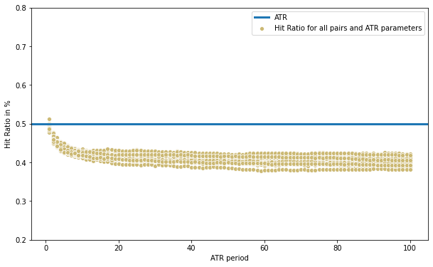
print(df_stats[df_stats['Hit Ratio'] >= 0.5][['Pair','ATR period','Hit Ratio']])
Pair    ATR period  Hit Ratio
CADCHF  1           0.500411
GBPCAD  1           0.511964
Interestingly we have two cases where the ATR was hit at least 50% of the time: both cases using an ATR of 1 period (so there is no average taken, just the value of the previous day’s range), and just barely above 50%.
We can also notice that the scatter plot shows a clear correlation between ATR period and the hit ratio. With very low parameter values the ATR serves better as a prediction for the next day’s range than with higher values. A parameter of around 15 to 100 produces little difference.
We can conclude that the average of the most recent days are more relevant to predict future range. That said, it is still not the best prediction, with most cases falling short of 50% and a curious aspect shown below:
plt.figure(figsize=(10,6))
sns.scatterplot(x=df_stats['ATR period'], y=df_stats['Mean'], color="y", label='Average error')
plt.ylabel('Average error from prediction to actual range')

plt.legend()
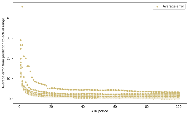
Here we can see that the average error increases dramatically when the ATR parameter is small. This suggests that, even though on the long term a lower parameter will serve as a correct prediction more often, when it misses, it misses by a higher margin. This behavior can also be expected because a low sample is more prone to produce unreliable indicator estimations.
Analyzing a possible adjustment for the ATR
One alternative could be to simply take a percentage of the ATR value for the prediction. This will naturally cause the hit ratio to increase, but will come at the cost of getting a lower expected range. Let’s take, for example, the same ATR parameter we used in the first example, 14 periods.
# Create dataframe to gather statistics
df_stats_alt = pd.DataFrame()

pct_atr = range(1,101)

for pair in pairs_list:
  df_calc = df[df['Pair'] == pair]

  # Calculate ranges
  df_calc['Range'] = df_calc['High'] - df_calc['Low']
  df_calc['TRangeH'] = abs(df_calc['High'] - df_calc['Close'].shift(1))
  df_calc['TRangeL'] = abs(df_calc['Low'] - df_calc['Close'].shift(1))
  df_calc['TR'] = df_calc[['Range','TRangeH','TRangeL']].max(axis=1)

  # Inside this loop, we will use the ATR 14 to get the hit ratio results
  for paramt in pct_atr:
    # Calculate ATR
    df_calc['ATR'] = df_calc['TR'].rolling(window=14).mean()
    # Create a column to check if the range of a given session hit the ATR or not
    df_calc['HitATR'] = df_calc['TR'] > (df_calc['ATR'].shift(1) * paramt/100)
    # Calculate the ratio of observations where the range hit the ATR
    ratio_hit = df_calc.iloc[14:,]['HitATR'].sum()/df_calc.iloc[14:,]['HitATR'].count()
    # Insert stats into dataframe
    stats_list_alt = [[pair, paramt, ratio_hit]]
    df_stats_alt = df_stats_alt.append(stats_list_alt)

df_stats_alt.columns = ['Pair', 'Pct of ATR', 'Hit Ratio']

plt.figure(figsize=(10,6))
sns.scatterplot(x=df_stats_alt['Pct of ATR'], y=df_stats_alt['Hit Ratio'], color="y", label='Hit Ratio for all pairs and ATR parameters');
plt.axhline(0.5, 0, 1, label='ATR', linewidth=3)
plt.ylabel('Hit Ratio in %')
plt.legend()
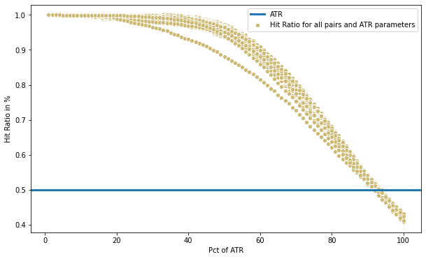
Here we see, for example, that if we use 40% of the ATR, we predict the range to be at least that value more than 90% of the time. Having a 90% certainty of anything is a big deal, but if it is only with 40% of the average range, than it becomes not so meaningful.
If we use 60% of the ATR, we get more than 80% of “good enough” predictions. More than 60% of the ATR and we see a sharp decrease in accuracy.
Conclusion
The ATR, as much as it is a good indicator for providing an insight about the volatility of a market, has to be used cautiously when a trader is trying to predict future range.
Still, it is one of the better tools available, very easy to calculate and with a variety of uses. And, of course, if we are using the ATR to get a value for our stop losses, than we might even benefit from the fact that the predicted value is reached less than 50% of time.
In future posts we will discuss other methods and different approaches do the ATR, specially with intraday data.